THE CONTEXT
After Promethean World acquired Explain Everything in late 2022, the file management system for the Whiteboard app, needed to be completely reimagined.
THE CHALLENGE?
Make the interface modern, cohesive with Promethean's design system, and scalable enough to support future apps.
All while preserving familiarity for 1.7M+ existing users.
MY ROLE
I led the visual redesign from start to finish defining requirements, aligning stakeholders, leading workshops, wireframing…
…building high-fidelity designs, testing with users, and collaborating across teams in the U.S. and Poland.
BEFORE
AFTER

“We’re very, very happy with the redesign… we’ve been wanting this for a long time.” — Engineering Team, Poland
WHY IT NEEDED A REDESIGN
A legacy interface couldn’t support the needs of 1.7M+ users or a growing toolset.
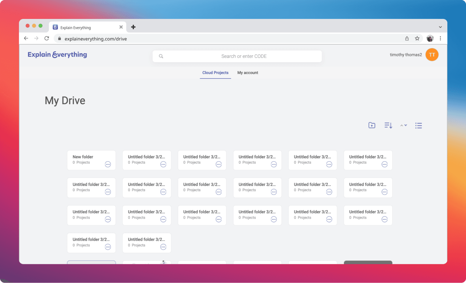
After Promethean acquired Explain Everything, it became clear the Drive experience needed a complete overhaul. The interface felt outdated, interactions were unintuitive, and the layout lacked visual alignment and clarity. Built on a separate design system, it no longer matched Promethean’s growing product ecosystem.
On a functional level, Drive was missing several core expectations for modern file management:
No support for nested folders
No drag-and-drop functionality
A barebones navigation experience with little room to scale
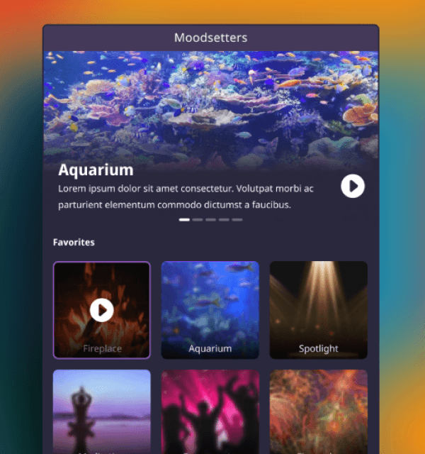
The vision for Promethean's future product suite called for something more: a unified experience where tools like Whiteboard, Polling, Moodsetter, and Timer could all live in one place. That meant Drive needed to evolve not just visually, but structurally to become the foundation for how millions of teachers would organize, access, and launch classroom tools.
MY APPROACH
I started with a full audit of the existing Drive, Identifying which features were critical to preserve.
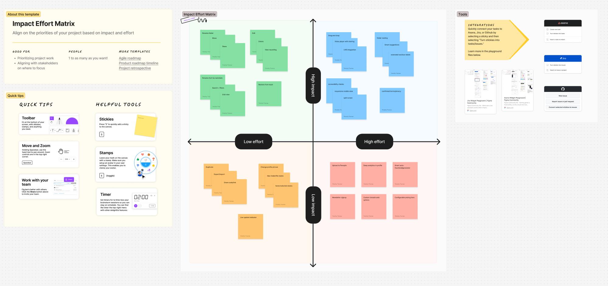
I created a requirement list, prioritized it via and effort vs. impact matrix, and benchmarked competitor file management systems to guide expectations.


Without any inherited documentation, I built my vision from scratch, but used Promethean's design system (Embers) to stay consistent and speed up alignment. I also ran a kickoff workshop and developed a moodboard + visual language to anchor the aesthetic direction.
I move quickly to high-fidelity wireframes using live components from the design system.
Because stakeholders responded better to visual clarity,

KEY CHALLENGES
Aligning Design Vision Across Teams
I collaborated with designers and teams working on other Promethean tools, like Polling, to ensure consistent interaction patterns and shared components. Early designs used Promethean’s Embers header/app switcher, but when the product vision shifted, I led the redesign of an entirely new navigation system.

Designing for Integration + Scale
A major challenge was imagining the future: Would Drive act like Dropbox for the entire suite? Would tools like Timer or Moodsetter be opened from within Drive? These questions shaped the architecture and demanded a flexible, scalable navigation approach.
THE FINAL SOLUTION
Refreshed visuals. Smarter interactions. Seamless future integration.
Redesigned file cards, folders, filters, and account settings using modern patterns
Introduced nested folder support and full drag-and-drop (missing in the original)
Created a new combined button+dropdown component to handle evolving use cases
Prototyped a split screen view for multitasking. Ideal for teachers managing multiple units or topics
Research-backed: Users expect modern file systems to support drag-and-drop, nested folders, and real-time visual feedback — a standard set by tools like Google Drive and Dropbox [NNG, 2020].
DESIGNING FOR THE CLASSROOM
One of my proudest innovations was the Long Press Menu, a solution designed specific ally for Promethean's ActivPanels.
Because some teachers can't comfortably reach the top of the screen I proposed a long-press radial menu that appears near the user's touchpoint, offering context-sensitive actions no matter their height or position.
Though not prioritized at launch, the Long Press menu was later implemented, validating the idea as both practical and scalable.
THE OUTCOME
Shipped, scaled, and set the foundation for what comes next.
Shipped: The redesigned Drive experience was implemented successfully
Collaborated across borders: Worked directly with devs in Poland, solving real-time issues during implementation
Unified vision: This redesign helped catalyze the idea of a single, centralized Promethean suite, with Drive as the anchor point for tools like Whiteboard, Polling, Timer, and beyond
Forward momentum: The project established scalable patterns that other teams could follow
WHAT I LEARNED
Every constraint was a creative opportunity in disguise.
Redesigns post-acquisition are part product strategy, part diplomacy
Early cross-team alignment prevents design debt later
Designing for classrooms means designing for everyone, including teachers at the edge of the screen.