CONTEXT
Can small tweaks improve Cleveland Pizza's conversion rates?
So Cleveland Pizza has so far been one of the best pizza places I've found in Cleveland since moving here. Dina's holds the top spot at the moment.
But I have some beef with Cleveland Pizza's website and app.
PROBLEM #1
The checkout button has no contrast

How long did it take you to spot it?
It took me a long time to spot it, especially on my phone. Even after ordering pizza from them multiple times. I still struggle to find it quickly and easily.
Can you imagine my frustration when trying to checkout and my brain just couldn't figure out how. This button doesn't follow common patterns.

How do we improve this?
Using contrast to make the button visually stick out will make it easier to spot and reduce drop rates

Which one sticks out the most to you?

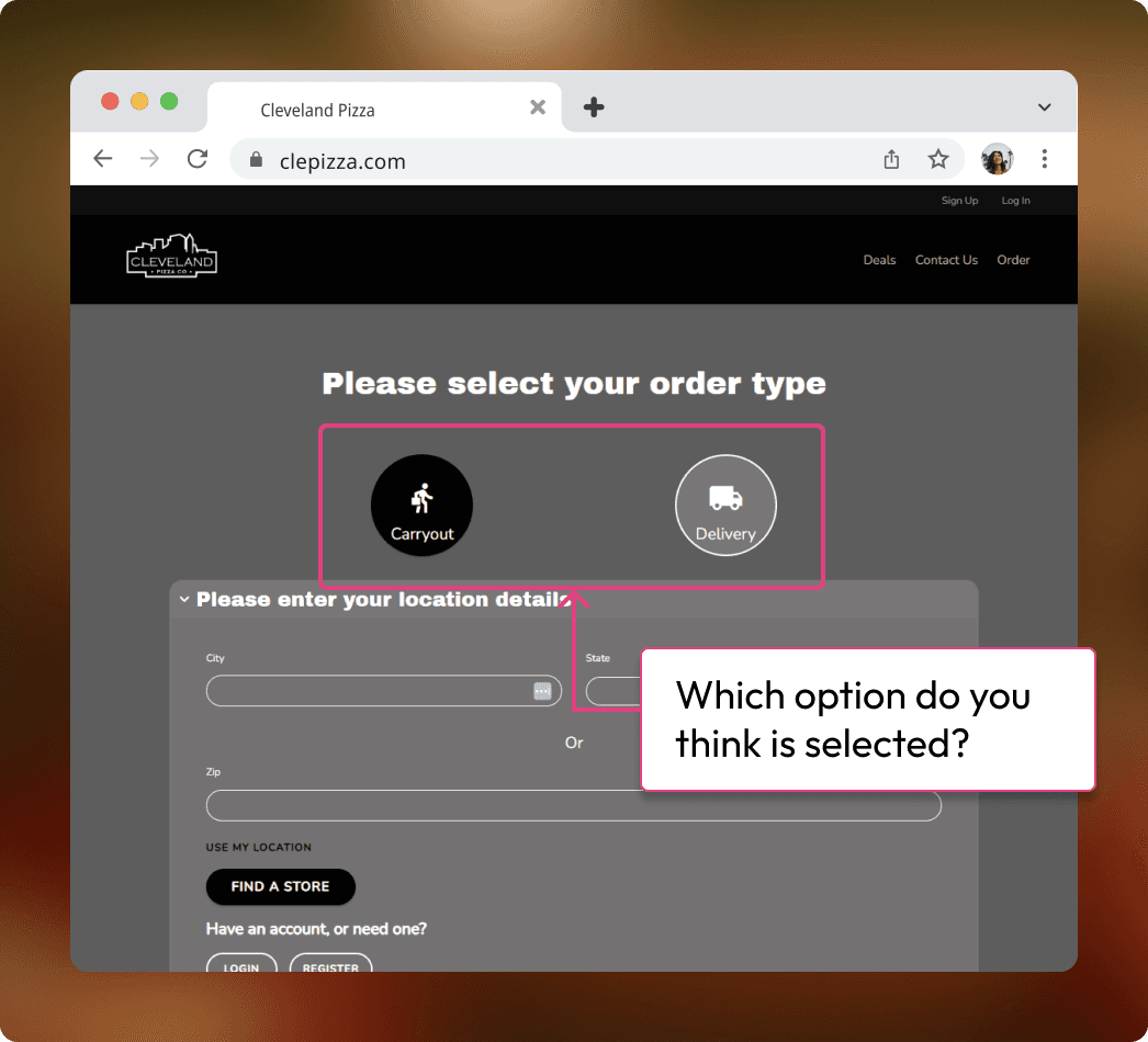
PROBLEM #2
Delivery or carryout, which is the active selection?
The first time I ordered pizza from them, I accidentally ordered carryout. I had assumed I had the correct option selected. I didn't notice it until I had already checked out and received an email stating when I can expect to pick it up.
I don't know about you, but I don't ever order pizza for carryout. I'm lazy and would like it delivered to me. lol